


Semi Automation of tasks through Notification Center
About Project
Role
UX Researcher
1x Product Manager, 1x UX Researcher, 5x Technical Account Manager
Qualitative & Quantitive Research, Job Stories, User Flows, Personas, Value Proposition & Usability Test Results
OVERVIEW
Why?
In the fast-paced realm of ride-sharing operations management, staying updated and responding promptly to real-time events is crucial. However, many of our ride-sharing business operators found themselves navigating a recurring obstacle: a lack of timely information on pivotal operational events, especially concerning fleet management. This gap often resulted in delayed actions, mismanaged fleets, and overlooked opportunities. Recognizing this pain point, we embarked on a mission to bridge this information gap with the introduction of the Notification Center.
The Notification Center is more than just a feature; it's a proactive solution tailored for ride-sharing operators. Designed to keep them in the loop about vital fleet and operational events, it ensures they're always equipped to make informed decisions.
Objectives: With the Notification Center, we aimed to
1
Empower Operators: Equip ride-sharing operators with instant notifications on pivotal operational events, from vehicle maintenance alerts to driver shift changes, ensuring they're never caught off guard.
2
Prompt Responses: Facilitate swift and informed decision-making, allowing operators to tackle events head-on and manage their fleets efficiently.
3
Boost Efficiency & Satisfaction: By keeping operators informed, we enhance operational efficiency, elevate customer satisfaction levels, and ensure smoother rides for passengers.
4
Enhance Fleet Management: Timely notifications lead to better fleet management, which plays a pivotal role in reducing operational costs and increasing vehicle longevity.
How..
The methodology for this project was structured into two distinct phases, each with its own set of objectives and deliverables:
1
Minimum Viable
Understanding the urgency to deliver tangible value to our ride-sharing partners, our initial strategy pivoted around the concept of a Minimum Viable Product (MVP). This approach allowed us to roll out a version equipped with urgent features addressing the immediate fleet and operational needs of our ride-sharing operators. Moreover, it provided a platform to solicit feedback, ensuring that subsequent versions were more aligned with the dynamic needs of the ride-sharing industry.
2
Diving Deeper
This case study offers a comprehensive look into our journey of conceptualizing and realizing the Notification Center for ride-sharing businesses. We'll shed light on the hurdles we encountered, the innovative solutions we adopted, and most importantly, the transformative impact the Notification Center has ushered in for our ride-sharing operators' day-to-day operations and overall satisfaction.
Process
ODI Framework and Design Thinking
Our methodology drew heavily from Design Thinking principles, emphasizing a human-centered approach that put user empathy and iterative problem-solving at the forefront. Initially, we engaged deeply with users' needs, employing a myriad of techniques such as interviews and observations to set the stage for creative ideation.
While our primary inspiration was design thinking, we augmented this approach with targeted elements from the Outcome-Driven Innovation (ODI) framework. Specifically, we hypothesized and anticipated potential outcomes based on the needs we had identified. These hypothesized outcomes underwent meticulous validation and were subsequently prioritized based on both their feasibility and their potential impact.
Recognizing that each product and market landscape had its own unique constraints, we aligned our validated outcomes with these limitations. This ensured that our solutions were not only suitable for the existing landscape but also adaptable to future changes.
In our exploratory phases, we utilized methodologies like Job Stories and Jobs to Be Done (JTBD) to delve deeper into what our users aimed to achieve. These methodologies served as powerful tools that resonated well with our design thinking ethos. Additionally, we employed the Value Proposition Chart to map out the unique value that our solutions offered, ensuring that we directly addressed the core needs of our users.
By skillfully blending Design Thinking principles with key activities and deliverables from the ODI framework, we crafted a holistic methodology. This approach not only helped us tackle immediate challenges but also equipped us with the tools to navigate future complexities effectively.
Discover
User Research
In the lead-up to the development of the Notification Center, user research was paramount. Throughout various stages of our process, we delved deep to grasp our customers' needs, challenges, and aspirations. Our multifaceted research approach encompassed:
1
Engaging with Technical Account Manager: Given their intimate rapport with our clients and profound understanding of client needs, our TAMs were invaluable sources of insights. Through in-depth interviews, we unearthed the challenges our clients grappled with.
2
Direct Client Consultations: By reaching out directly to our clients, we gained firsthand knowledge of their experiences and expectations. These interactions illuminated the tangible repercussions of the challenges they encountered.
3
Historical Feedback Analysis: We sifted through feedback accumulated over time from our customers. This retrospective analysis spotlighted recurring challenges and predominant pain points.
3
Usability Assessments: By evaluating the user-friendliness of our existing systems, we pinpointed areas of contention and potential enhancement opportunities.
Our research painted a vivid picture: customers were frequently blindsided by pivotal operational events, often realizing them when it was already too late. They found themselves navigating intricate workarounds or confronting issues that had spiraled out of control. This information lag was a pronounced challenge, eroding operational efficiency and dampening customer satisfaction.
Moreover, it became evident that customers yearned for a proactive solution. They sought a tool that would keep them abreast of key events in real-time, empowering them to act promptly and decisively. Additionally, they emphasized the importance of a user-friendly solution that would meld seamlessly into their established workflows.
Armed with these insights and after an initial exploratory research phase, we embarked on crafting user stories to guide our development process.
Quantitative Research through Surveying
Our first step was guided by the principles of Design Thinking, particularly the 'Empathize' phase, where understanding the user is paramount. We aimed to ensure that our initial hypotheses about potential outcomes were aligned with real-world user needs and market conditions.
To close any gaps between our early assumptions and actual user experiences, we embarked on a comprehensive data-gathering journey. Leveraging Design Thinking's emphasis on user empathy and observation, we initiated a survey aimed at our user base to explore their habits around notifications. Our goal was to understand not just what users preferred in terms of notifications but also how frequently they engaged with them and how satisfied they were with the existing system.
This phase was not merely about validating our preliminary assumptions; it was about enriching our design approach with quantitative data. Such data would provide us with invaluable insights for ideation and prototyping phases, ensuring our Notification Center would be both functional and deeply attuned to user needs and market trends.
Define
User Stories
Following our initial research, we transitioned into the 'Define' phase of Design Thinking, aiming to narrow down our insights into user-focused goals and needs. A pivotal part of this phase involved the crafting of user stories to guide the development of our Notification Center feature.
Initially, these stories were broad, capturing a range of user interactions and experiences. However, as we honed in on the specifics, the stories began to focus solely on notifications. By documenting these user stories, we were able to view the Notification Center through the lens of the user. This exercise not only clarified our ideas on paper but also enriched our understanding of what users genuinely wanted and expected.
Through this methodical approach of writing user stories, we transformed vague notions and quantitative data into actionable insights, setting the stage for subsequent ideation and prototyping.

User Stories (Optimized for Notifications)
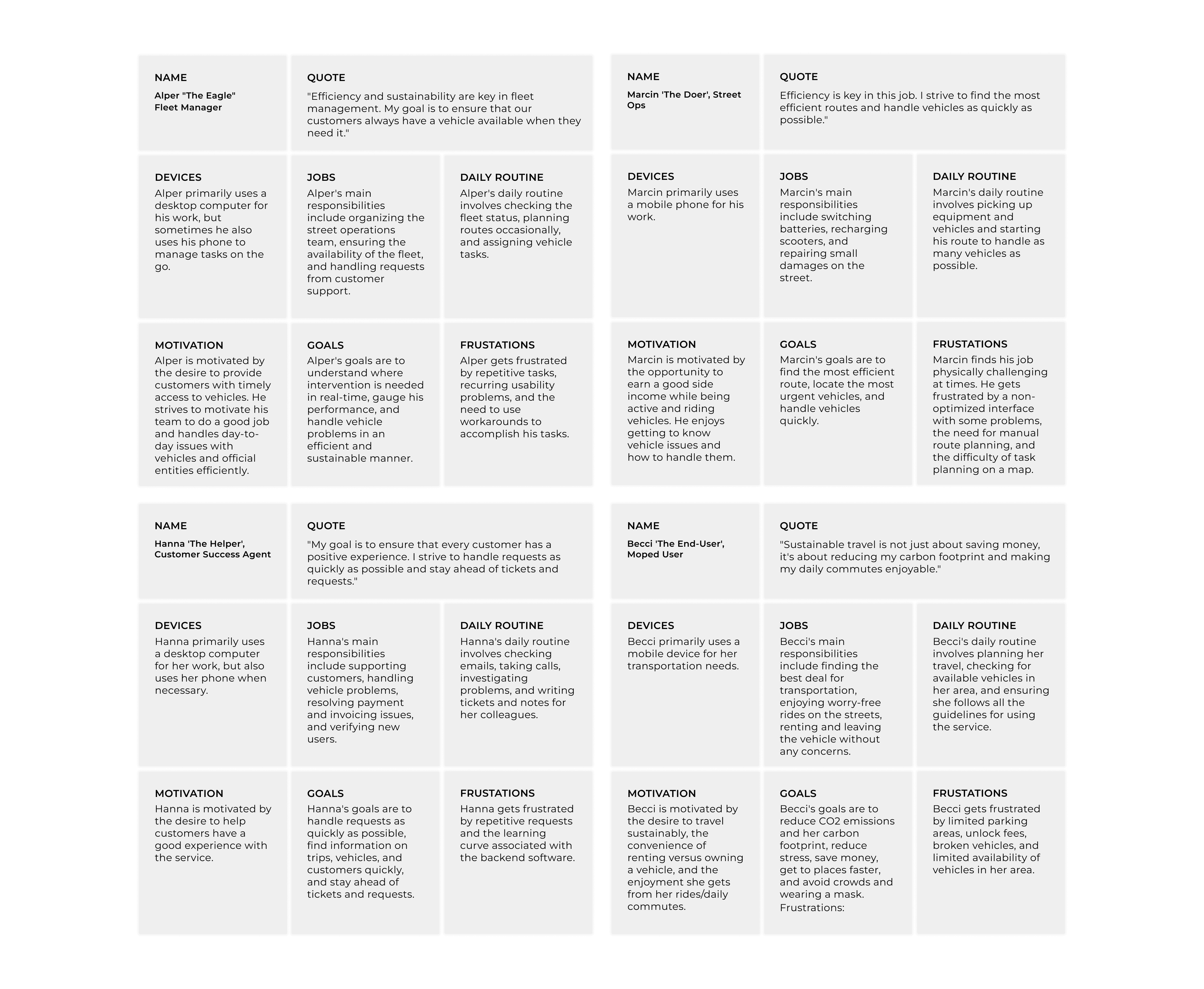
Personas
As a continuation of our 'Define' phase within the Design Thinking framework, we delved deeper into understanding our users by developing comprehensive personas. These personas represented key roles, such as fleet managers, street operators, customer success agents, and end-users, each interacting with the Notification Center in their unique ways.
The creation of these personas was an integral part of our empathetic design approach. By mapping out the distinct needs and behaviors of each persona, we were able to tailor the Notification Center's features to a diverse user base. This helped us ensure that our design solutions would be inclusive and meet a wide array of user needs.
The user personas served as a valuable foundation for informed design decisions, further enabling us to align our Notification Center with user expectations and requirements effectively.
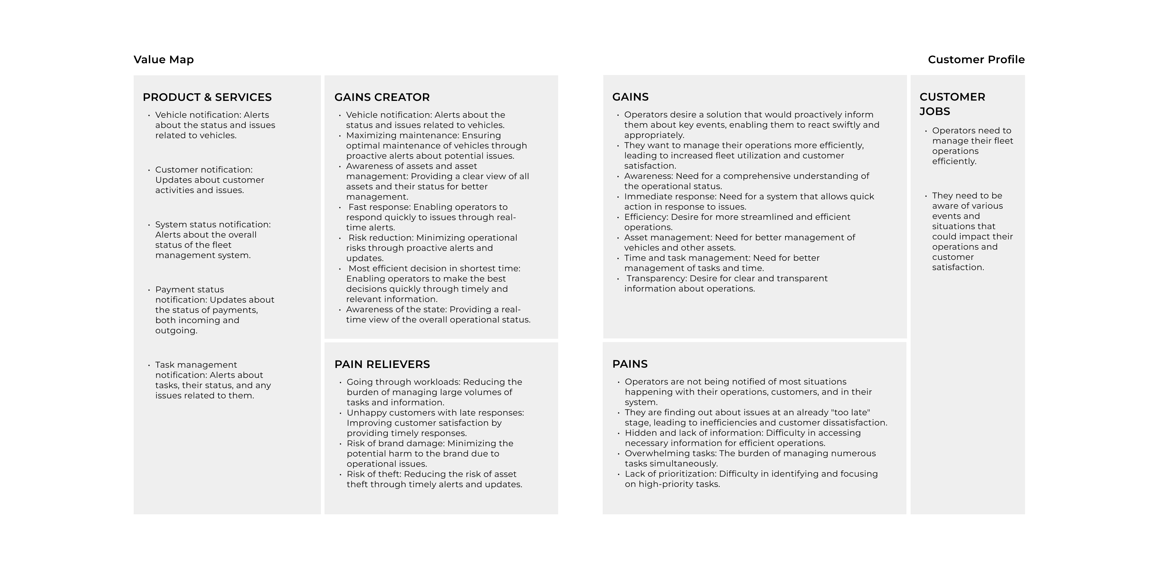
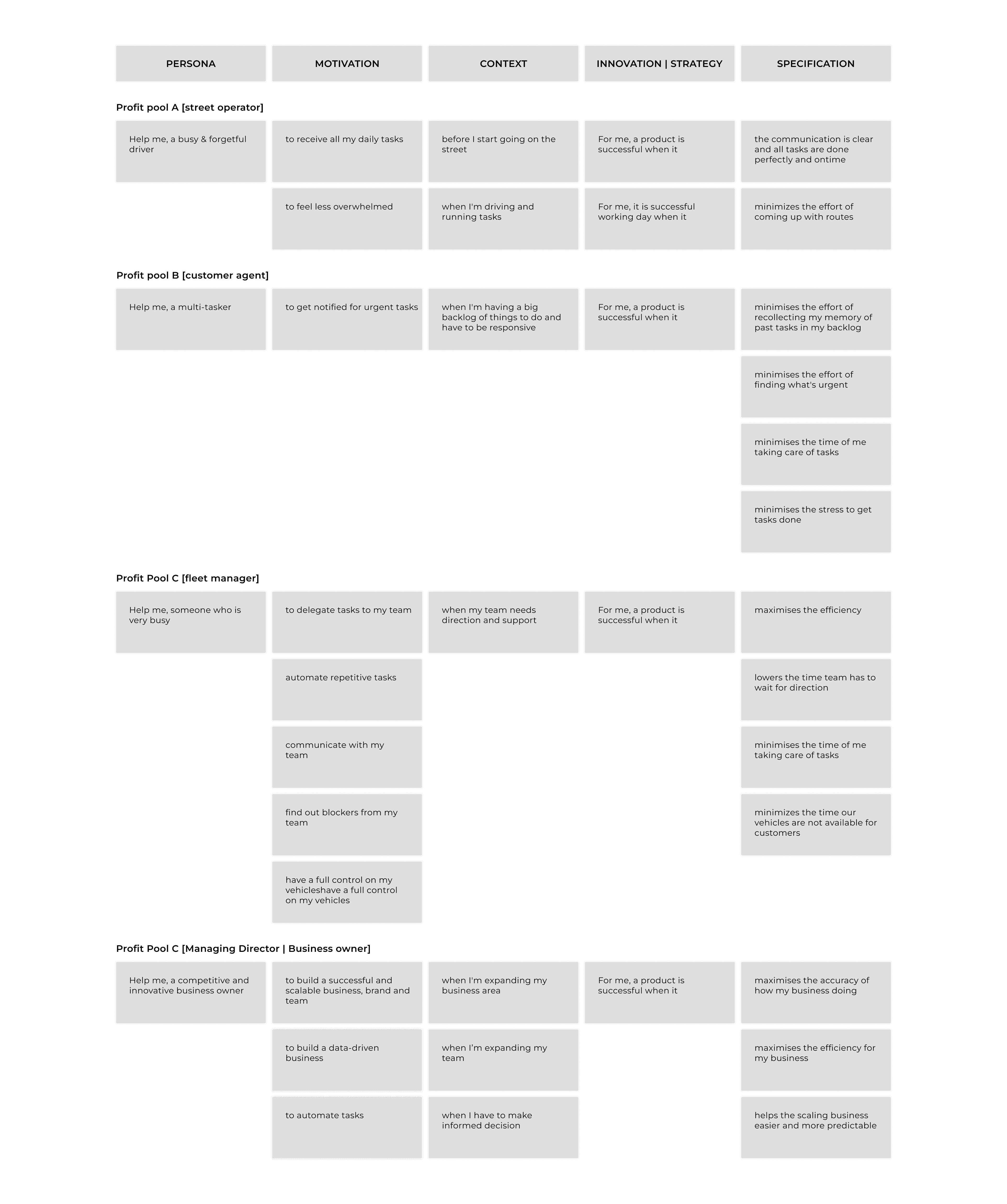
Value Proposition Canvas
After crafting the user stories and personas, I turned to the Value Proposition Canvas as a tool to further refine our approach. The Value Proposition Canvas is a tool that helps teams ensure their products or services match what customers really want and need
The canvas is split into two main parts:
1
Customer Profile: This side focuses on the user. It looks at their jobs (what they're trying to get done in their day-to-day), their pains (challenges or obstacles they face), and their gains (benefits they hope to achieve).
2
Value Map: On this side, we list out the features of the Notification Center. We then match these features to the jobs, pains, and gains identified in the Customer Profile. This helps us see how our product can help users, where it fits in their lives, and how it can make things better for them.
By using the Value Proposition Canvas, I was able to position the Notification Center around what the customer values most. I identified the key benefits, features, and experiences that the feature offers. This step was crucial in ensuring that the Notification Center would not only be a functional tool but also one that truly resonates with the needs and desires of the users.
IDEATE
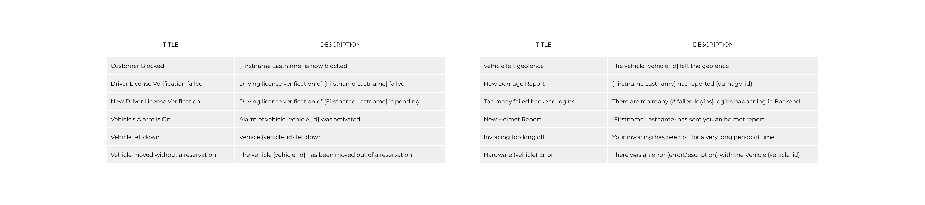
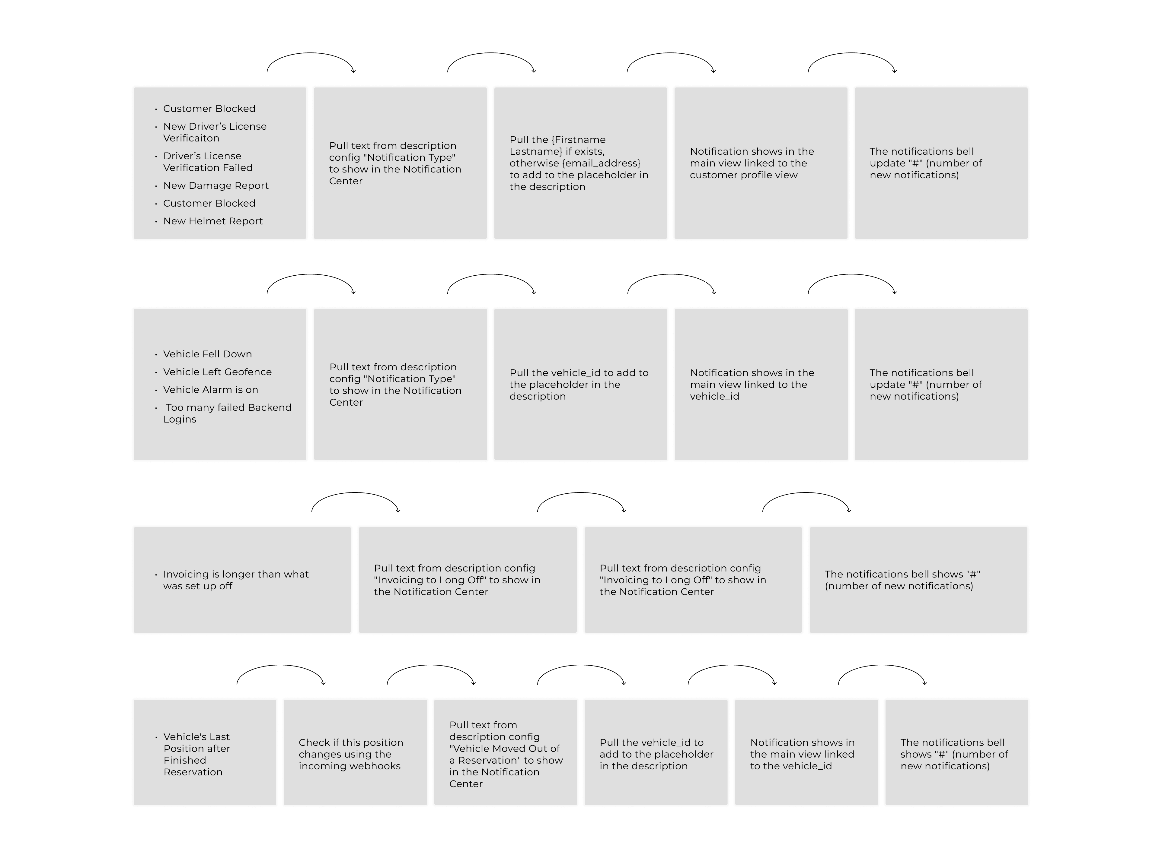
Notification Types
Using the insights from the user stories, we then defined the different types of notifications that the system could send. This included notifications about vehicle status, user status, system status, payment status, and task management. This categorization helped me to understand the breadth of information that needed to be communicated through the Notification Center.
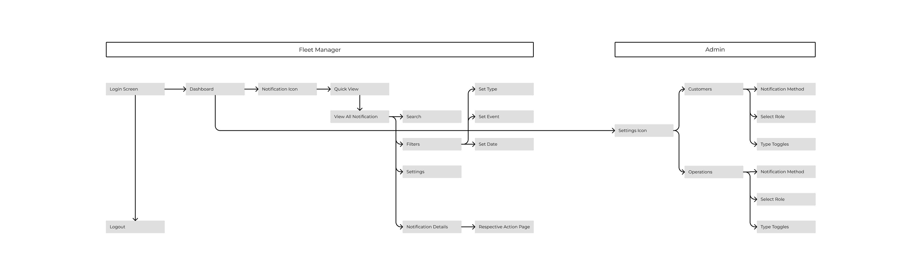
High Level User Flow
In a strategic move to delineate the project's scope and facilitate user interaction, we crafted a high-level user flow for the Notification Center. This first draft of framework served as a roadmap, outlining how various components within the Notification Center would be accessed. Moreover, it provided clarity on the entry and exit points, offering a foundational understanding of the basic user journey through the system.
Feasibility and Configuration Discussion
With a clear understanding of the user requirements and notification types, I then assessed the technical feasibility of the proposed feature. we ideated how notifications would be triggered, how users could customize their notification preferences, and how notifications would be delivered. This step helped to ensure that the Notification Center would be technically achievable and meet user needs.
Customer Needs | Desired Outcomes Analysis
Afterwards we delved deeper to better align our Notification Center with our customers' expectations. I carried out a comprehensive analysis to understand what customers really wanted from the Notification Center and the results they hoped to see. It was about ensuring that the real-world benefits our customers expected were in line with what the Notification Center would deliver. By focusing on both their immediate needs and the broader outcomes they desired, I aimed to ensure that the Notification Center would not only meet its functional objectives but also resonate with the larger goals and aspirations of our users.
CONCEPTUALIZE
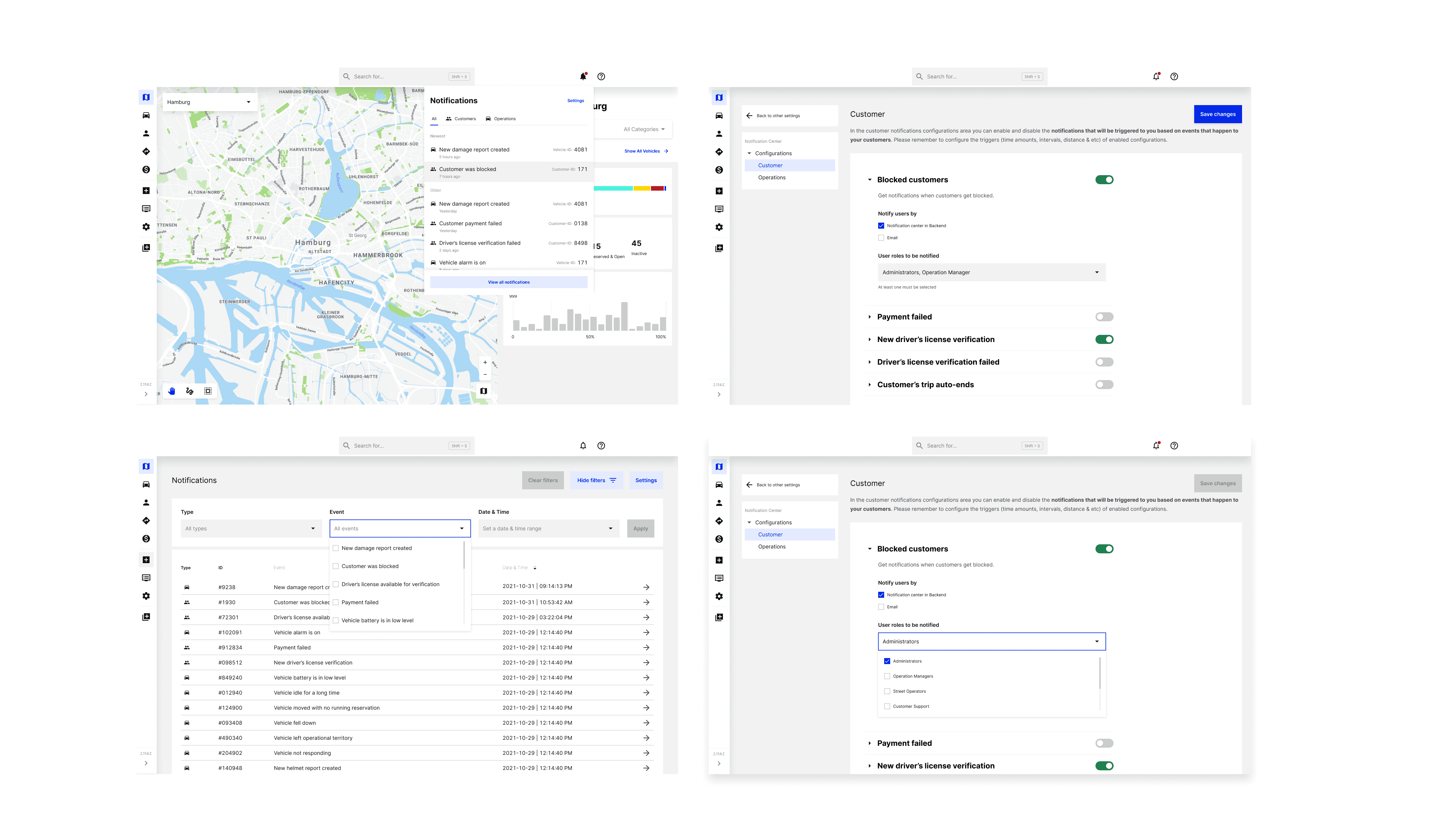
Visual Designs
Finally, I turned the ideas and requirements into wireframes followed by visual designs and then prototypes. This involved designing the user interface for the notification settings, creating prototypes for usability testing, and iterating on the design based on user feedback. This step brought the Notification Center to life and allowed me to test and refine the feature before implementation.
TEST
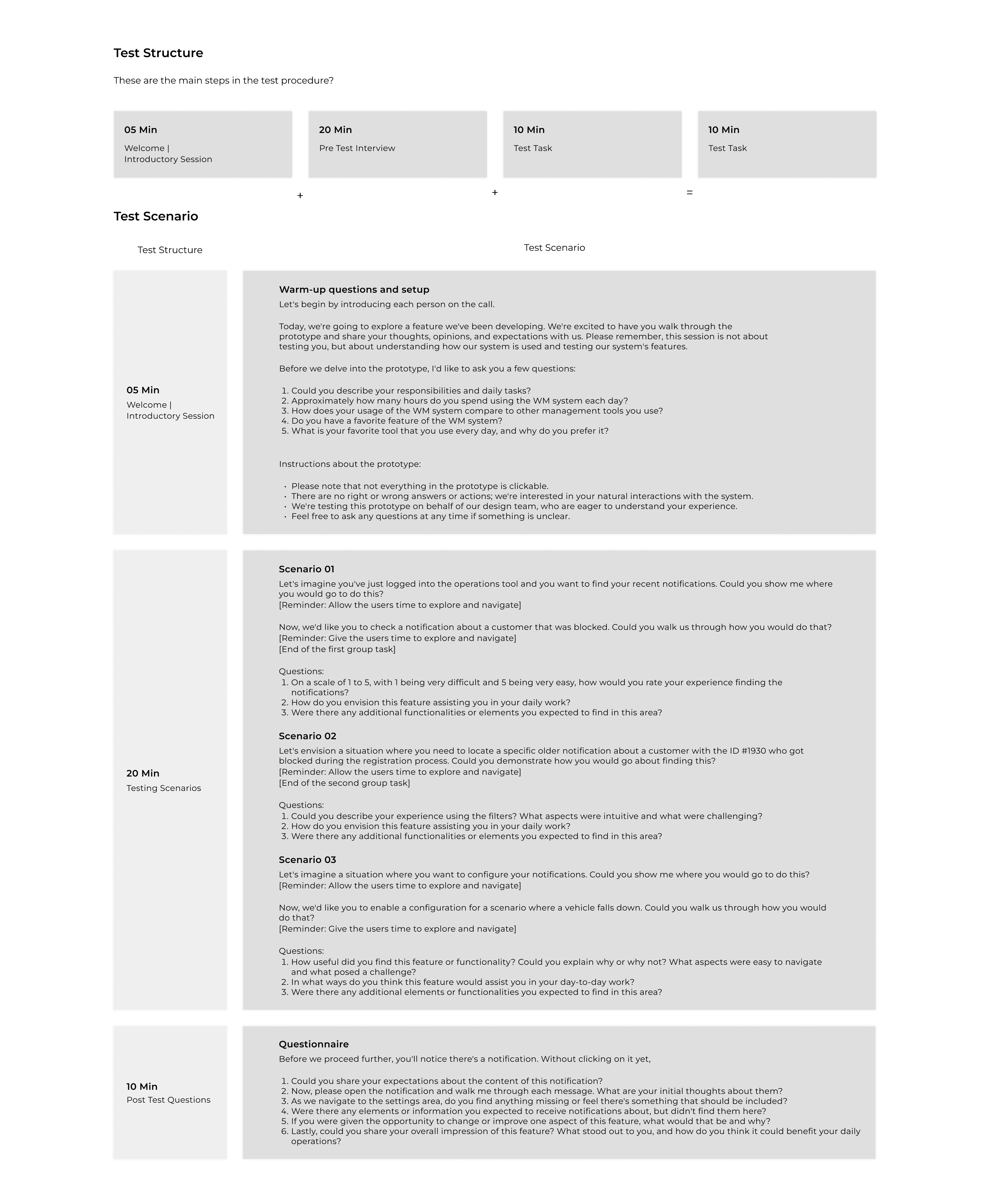
Usability Testing
In the 'Test' phase of our Design Thinking journey, validation was our core objective. Recognizing that quantitative findings could only tell us so much, we leaned into qualitative research to add depth and nuance to our understanding of user interactions. Specifically, we carried out usability tests to observe how users navigated through the Notification Center.
These hands-on tests were invaluable for identifying both seamless experiences and potential bottlenecks within the system. By observing users and their feedback in real-time, we gained immediate feedback on what was working well and what needed refinement. This approach was essential for validation because it allowed us to make data-driven adjustments to the Notification Center.
The insights gleaned from these usability tests were instrumental in fine-tuning the Notification Center. They enabled us to align the feature more closely with user expectations, thereby providing a more effective and intuitive user experience. This rigorous validation process was crucial in not only confirming the efficacy of our design but also in preparing it for future iterations and improvements.
Results
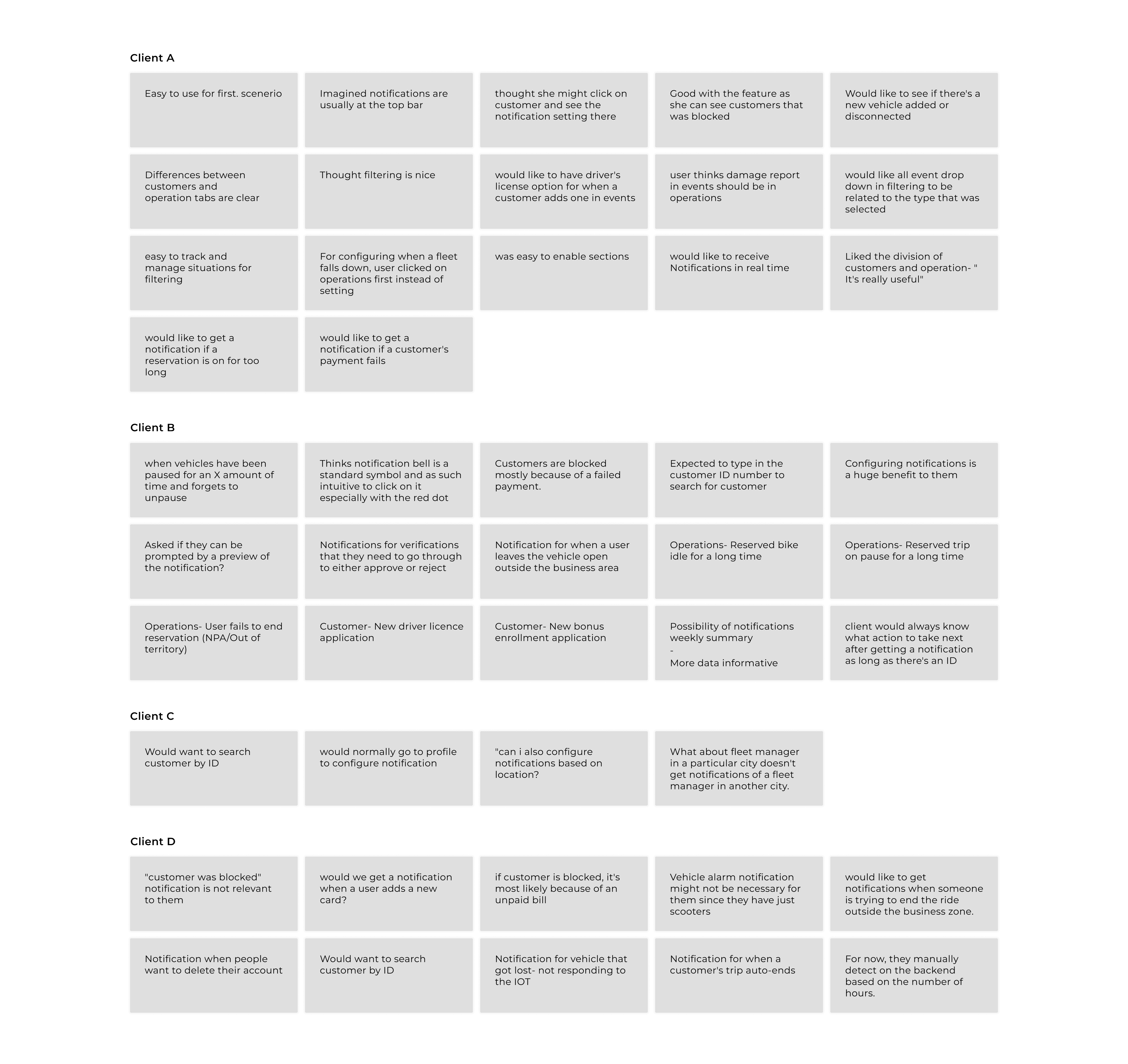
When it came time to share our findings, it's essential to note the unique approach we took during our research. While we began our interviews with a structured script, the conversations often evolved into more casual, open dialogues. This approach was intentional, as we wanted to foster an environment where participants felt at ease to share their genuine thoughts and experiences without being confined to a strict set of questions.
As a result, the feedback we gathered wasn't tied directly to specific questions but rather captured the overarching sentiments, concerns, and suggestions of our users. This collection of insights represents a holistic view of user experiences and needs, rather than segmented responses.
In presenting these results, we've grouped the feedback into thematic areas, highlighting common trends, notable insights, and areas for potential improvement. This format not only provides a comprehensive overview of user feedback but also respects the open and candid nature of our interactions with participants.
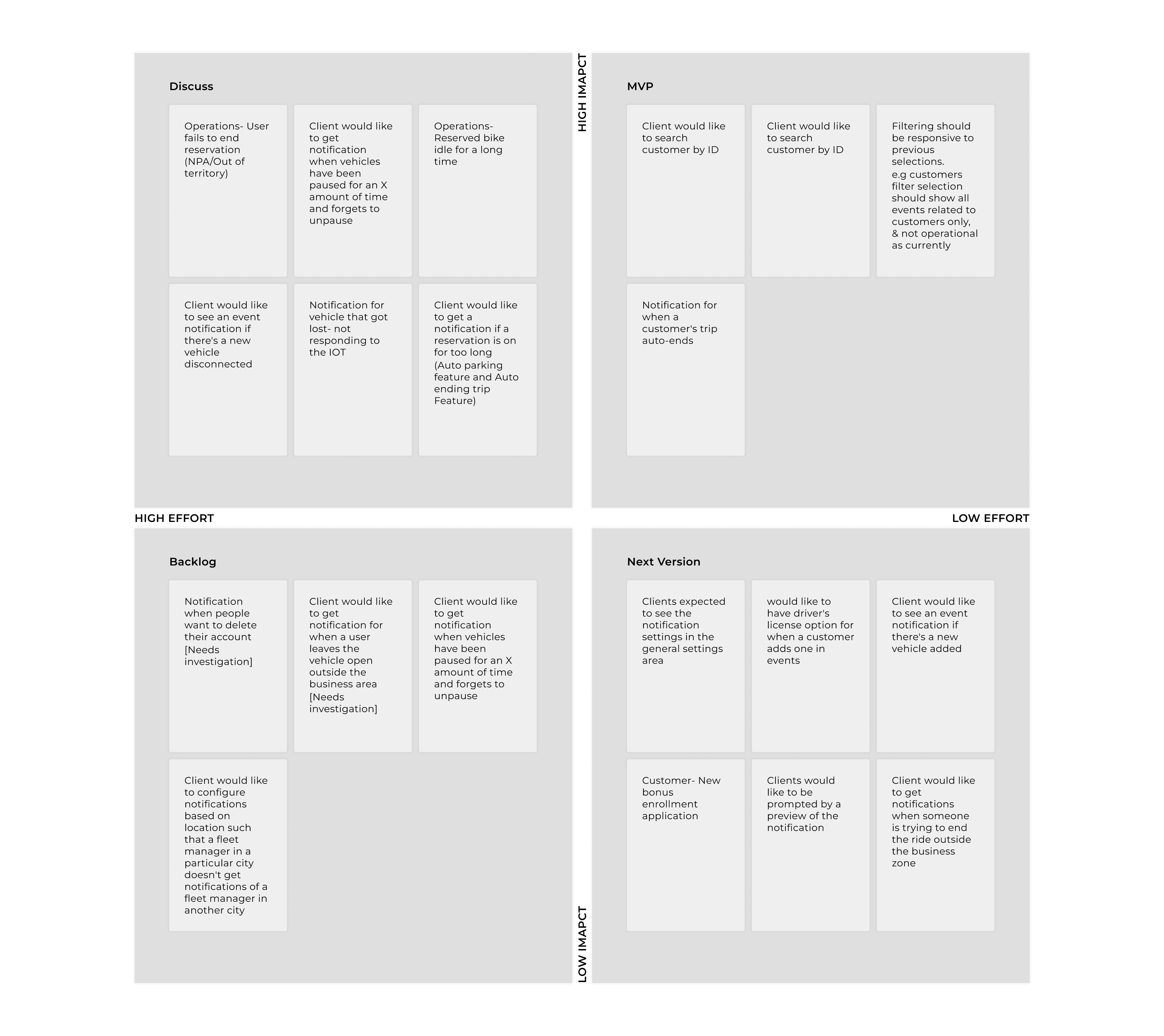
Grouping, Analyzing and Prioritizing Findings
Post-validation our next step was to make sense of the vast array of feedback and insights we had gathered. We embarked on a structured approach to distill and prioritize this information:
1
Grouping the Findings: We began by categorizing the feedback into distinct groups based on common themes and patterns. This allowed us to identify recurring sentiments and shared experiences among users, ensuring that no critical insight was overlooked.
2
Identifying Common Themes: Within these groups, we distilled the feedback to capture the core essence or the common 'gist' of what users were conveying. This process helped us understand the broader implications and underlying patterns in the feedback.
2
Prioritization Using a Matrix: With our findings grouped and themes identified, we then moved to prioritize them. For this, we employed a matrix with 'Impact' on one axis and 'Effort' on the other. By plotting our findings on this matrix, we could visually assess:
High-impact, low-effort items: Quick wins that could bring immediate value with minimal effort.
High-impact, high-effort items: Strategic initiatives that, while requiring significant resources, could bring transformative benefits.
Low-impact, low-effort items: Potential enhancements to consider for future iterations.
Low-impact, high-effort items: Areas to potentially deprioritize given the disproportionate effort for limited gain.
This structured approach ensured that our subsequent actions were not only informed by user feedback but also strategically aligned with our capacity and the potential value to users.
Subsequent phases.
Upon concluding our usability tests, we entered a critical iterative stage in the 'Test' phase of our Design Thinking process. Armed with tangible findings from the tests, we set out to refine and optimize the Notification Center. These adjustments were not merely superficial; they were backed by real user feedback, making them intrinsically valuable for improving the user experience.
As part of this iterative process, we also updated our backlog and product board with key learnings and additional feedback that couldn't be immediately incorporated but held promise for future releases. This planning ensured that the insights we had gathered would have a long-lasting impact, driving continuous improvement in subsequent versions of the Notification Center.
Key Learnings:
1
Prioritize User-Centric Design Over Feature-Centric Development: One of the most important insights was the need to prioritize the user's needs over the sheer volume of features. Usability testing revealed that users valued intuitive and efficient design above a cluttered interface filled with features that did not serve their immediate needs. This reaffirmed our commitment to a user-centric design approach.
2
Integrate, Don't Isolate: Build Features that Complement Existing Workflows: Another critical learning was the importance of integration. Users showed a preference for features that smoothly fit into their existing workflows, rather than standalone features that required them to adapt. This emphasized the need to build features that are not just innovative but also seamlessly integrated into existing user practices.
By incorporating these key learnings into our iterative design process, we strengthened the Notification Center's alignment with user needs and expectations, setting the stage for its long-term success.
Other Case Studies
Contact

Khurramameer21@gmail.com

+49 176 29438752


Imprint